Riachuelo
Product Discovery and Digital Strategy
Riachuelo is one of the most well-known fashion retail store in Brazil. In 2018, the company had not a properly mobile app that reflected its relevance and influence.
I was responsible for designing a discovery project to help the company develop the foundation its new channel.

The design process
To accomplish that, we wanted to answer the question: How might we convert the new app in the cornerstone of the Riachuelo's omnichannel strategy?
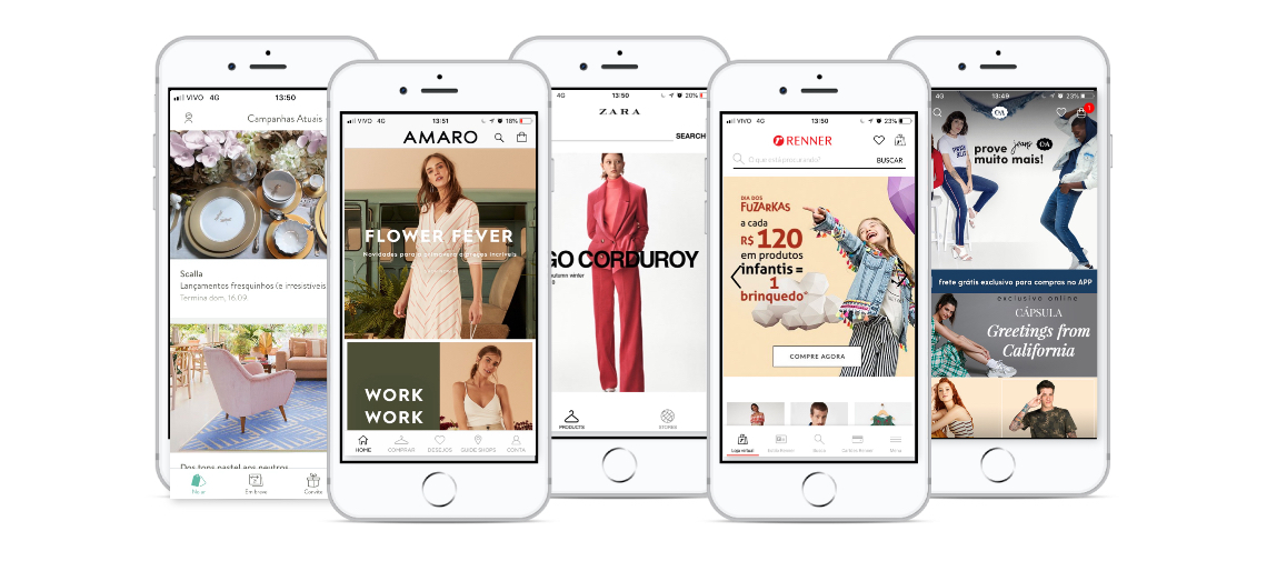
After the meetings with stakeholders, we chose to use a desk research. It was divided into three main parts: 1 ) Competitive analysis of the main competitors 2) A deep heuristics analysis of its e-commerce (navigation structure, style guide, goods e voice tone) and 3) Good references and best practices in the e-mobile apps.
Workshops
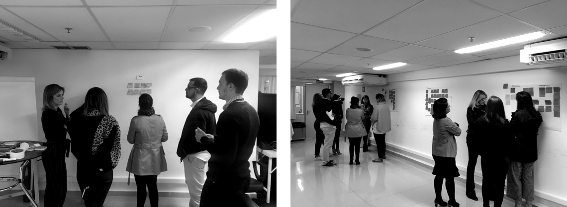
We decided to run a co-creation workshop with partners, customers, and stakeholders based on Design thinking methodology. The main focus was to list opportunities and knowledge about the customer's behavior in the physical stores and also knowing their actual pain points.
We presented two personas that represented the Riachuelo's customer. Following that, we had the opportunity to perform a brainstorming session using the "How might we.." technique. The questions were previously chosen by us to give some directions.
How might we...
- please the customers in the returns?
- be more helpful to customers at the moment of choosing a good?
- fascinate the customers in the dressing room?
The sessions' results were incredible and confirmed our hypothesis about the main resources the app needed.
Findings
Once we understand the main opportunities and pain points during the customer's journey, we discover some "blindspots operations" the gone beyond the app. In an official presentation, we drove the issues for the stakeholders about the risks as part of our work.
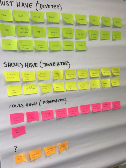
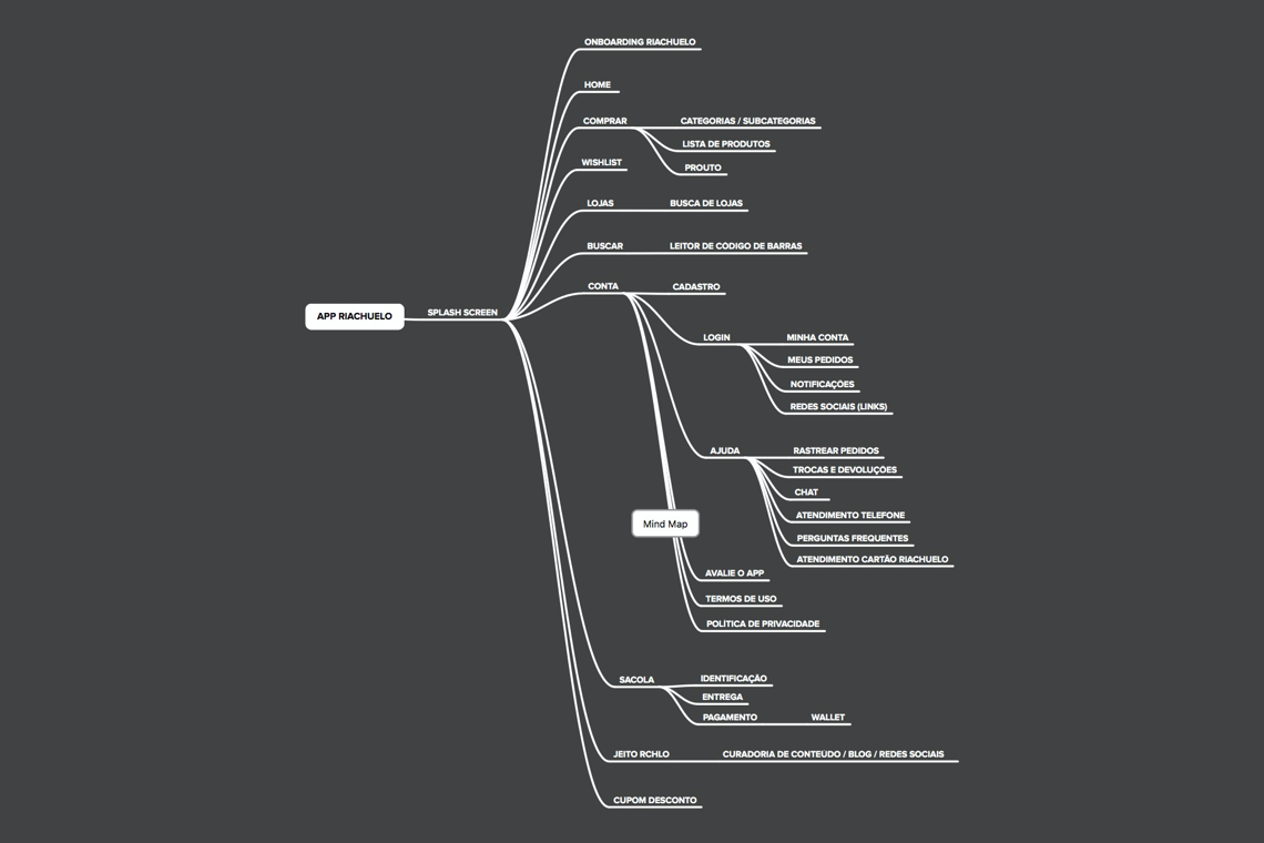
We organized all the main ideas in a MoSCoW (Must have, Should have, Could have and Would have) matrix that helped us to visualize which functions the customers could interact with. This arrangement also was the foundation to prioritize what screens needed to be delivered.
Wireframes
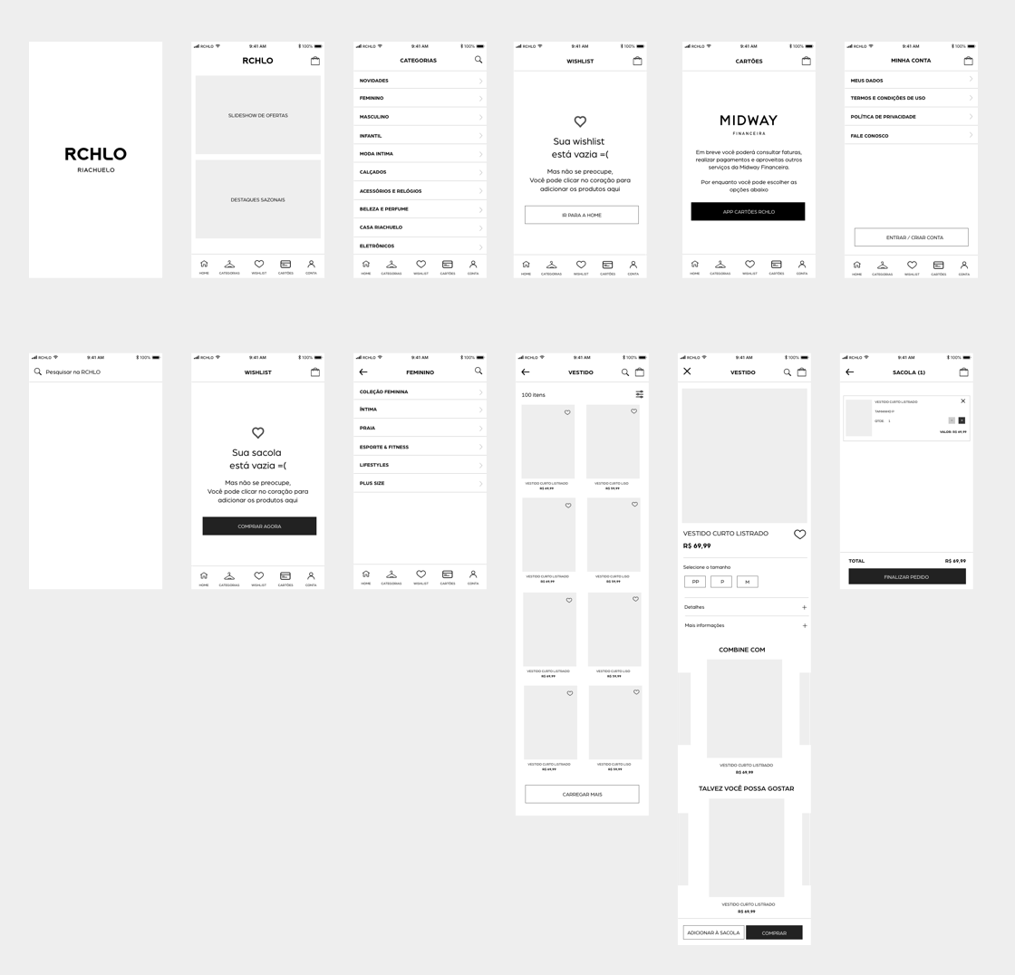
Besides the main ideas and functionalities settled and approved, the final step was starting the design of the main app templates inspired by Riachuelo e-commerce (web). I use some brand assets to give the wireframes the best look-and-feel as possible.
All the customer journey was produced and addressed to the Riachuelo's team.
Results
At the time, I didn't cooperate in the project delivery stage. However, in 2019, the Riachuelo website and other digital channels received investments of R$ 168 million. The new app was launched respecting all the main elements, components, and layout decisions produced by us.
Next project